Robert Stern Architects Website
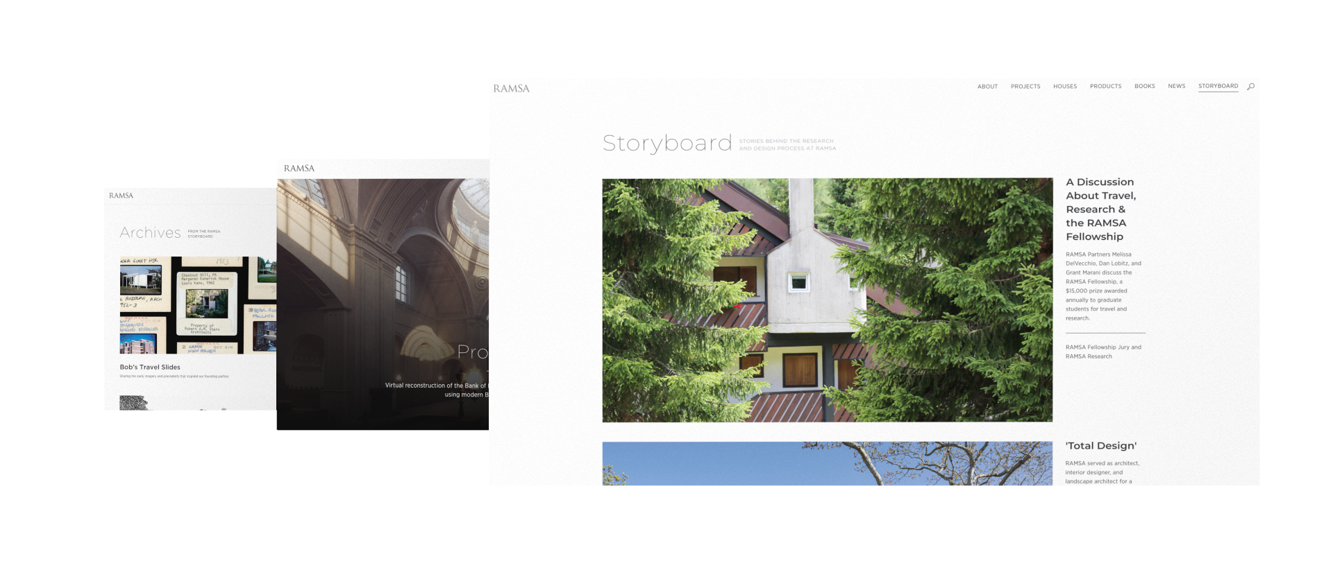
For a steady and gradual upgrade to the New York architecture firm's website, I led the creation of a brand-new Storyboard page with loading choreography, project page templates, filters and new global navigation.
Date
2019
Client
Robert A. M. Stern Architects
GoodFolk Agency
Category
Creative Direction
UX/UI
Interaction Design
01 Problem
The RAMSA team reached for help creating a series of upgrades to their website, most of which needed to be part of a CMS-backed template that is easy for team to reuse after the project was complete.
02 Approach
As creative director and lead designer for the project, I spent a lot of time engaging with the RAMSA team to get a sense of their design preferences and vision for the site, including not just aesthetics but also future upkeep.
03 Solution
Because the team wanted to new features to be reusable for future projects, my team and I created a custom CMS backend where we compiled different layouts and design patterns into a logical and intuitive framework. As for the aesthetics, we leaned into RAMSA's love for minimalism while adding more personality into site through loading animations, transitions and other interactions.
Storyboard pages and grid optimization
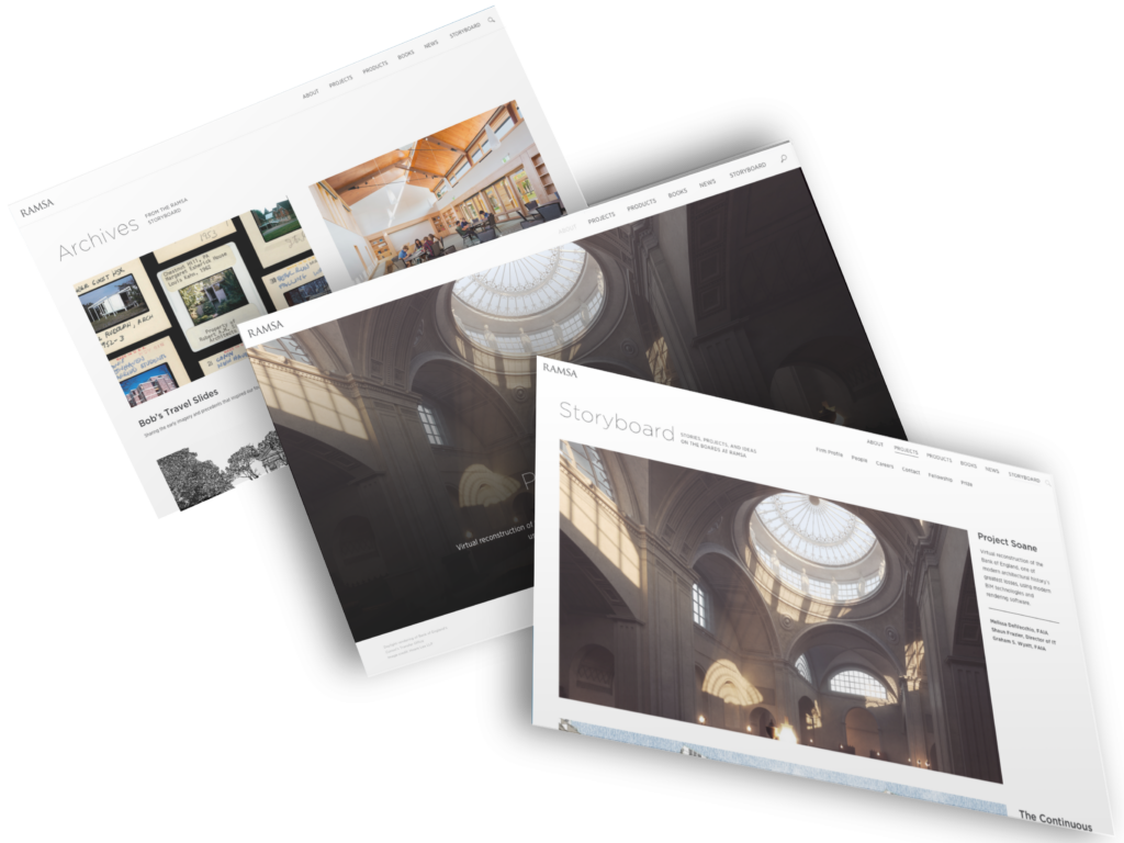
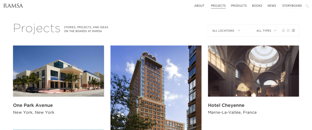
The Storyboard section was the first part of the RAMSA redesign, and it taught me a lot about the stakeholder’s design philosophy. Above all, the team was full of minimalists with a high attention to detail. They were curious about how the website grid could be optimized, to help streamline page templates. So as part of the Storyboard page build, I created a new responsive grid system that standardized spacing and layout across the rest of the site.
Extending the visual design system through new filters
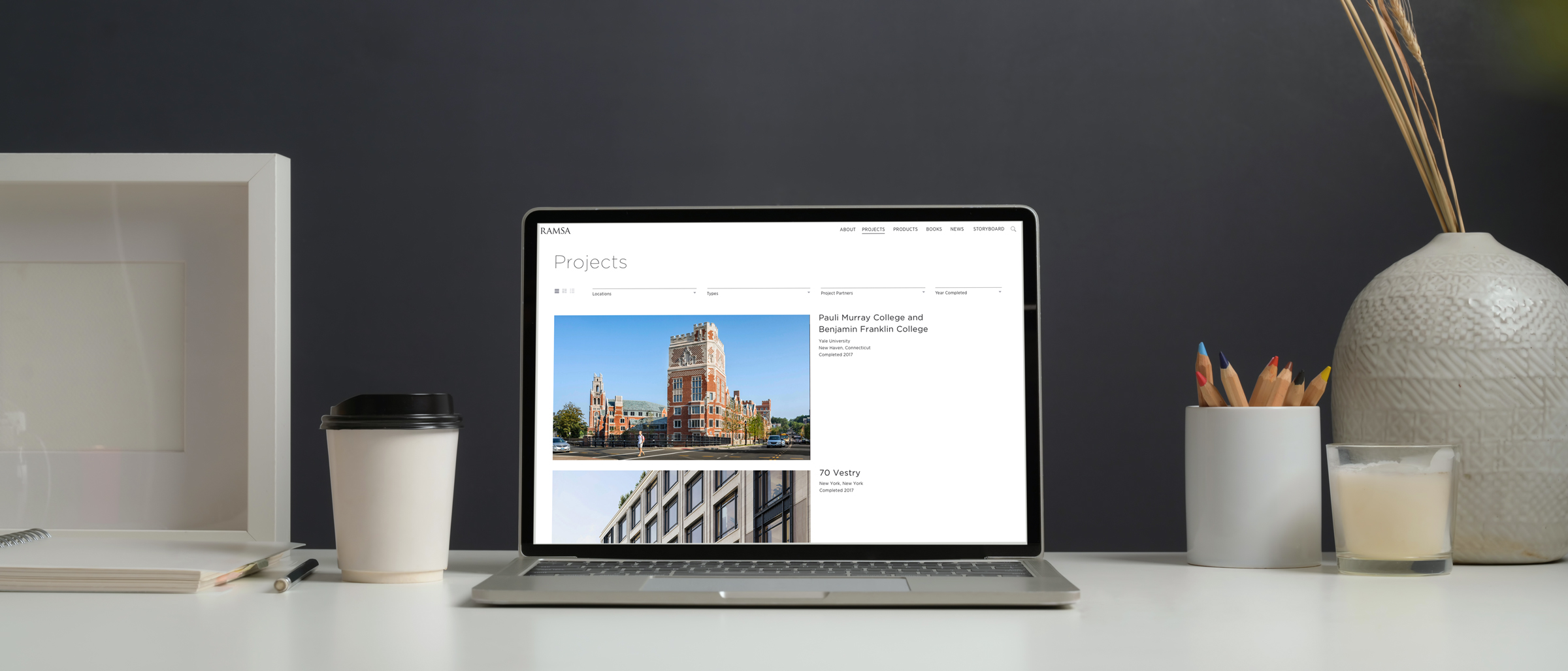
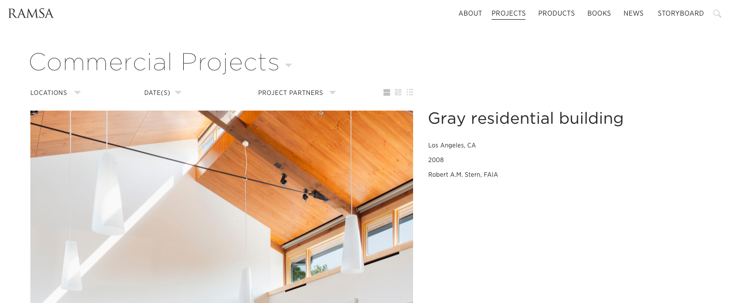
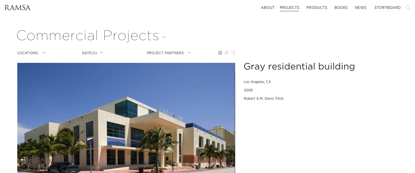
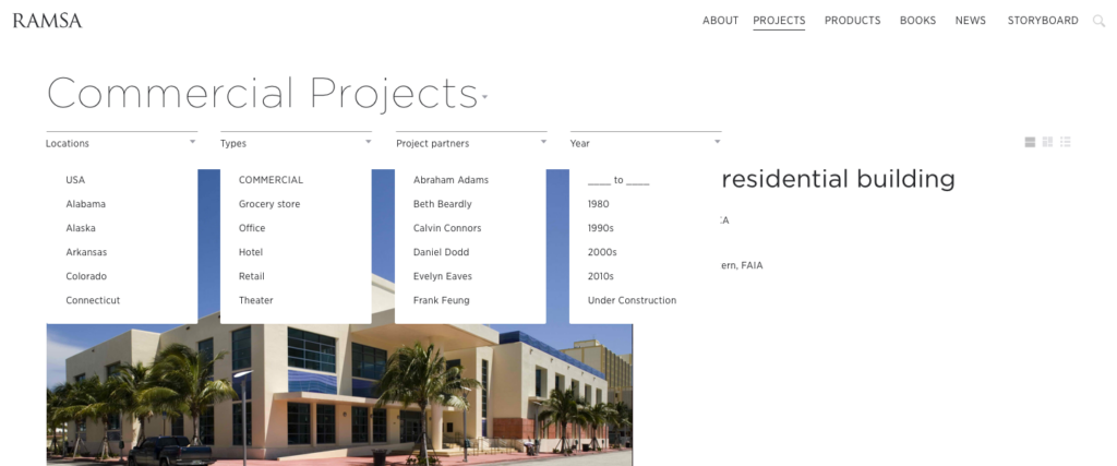
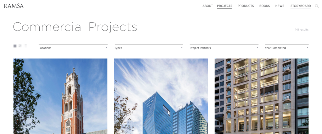
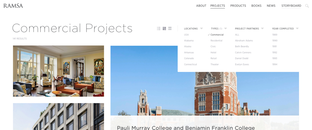
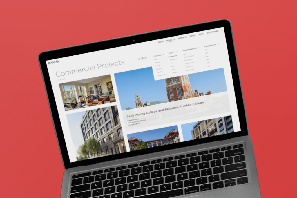
In order to improve the functionality of of project pages, I was tasked with creating a new filter system and developing a range of visual options for it, as means of extending the visual language of the website further into the UI space.
Refreshing the RAMSA typography through a new style guide
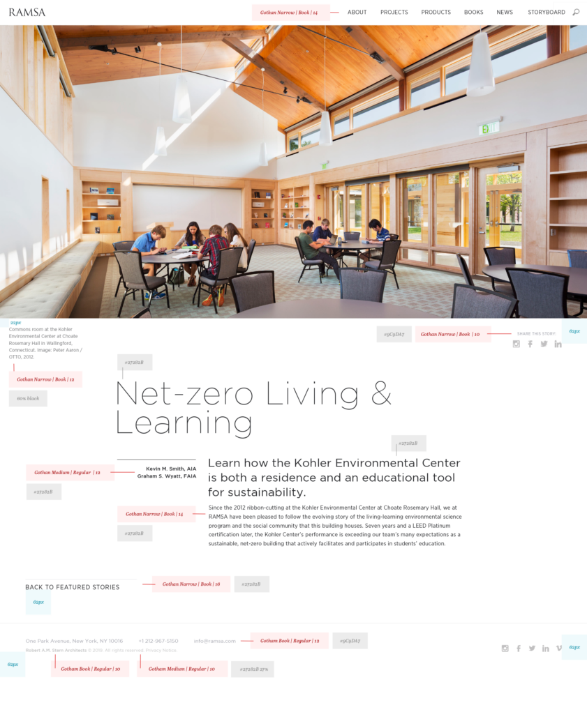
The client wanted to keep their original font families while maintaining clear constraints for typography. Doing so does not only help maintain simplicity, but also made it easier for them to take back over the website and create new pages after the project was complete.
As such, I took on the task of creating a style guide for the website’s typography, making sure to incorporate just enough of the previous set of options to ensure the strongest parts of the site aesthetics carry over into its updated form.
Results
Between introducing subtle transitions, interactions and loading effects, and tying them into the content management system, we were able to create simple pages and features that were easily replicable, and have been successfully maintained by the RAMSA team ever since.


