Digichina Website & Branding
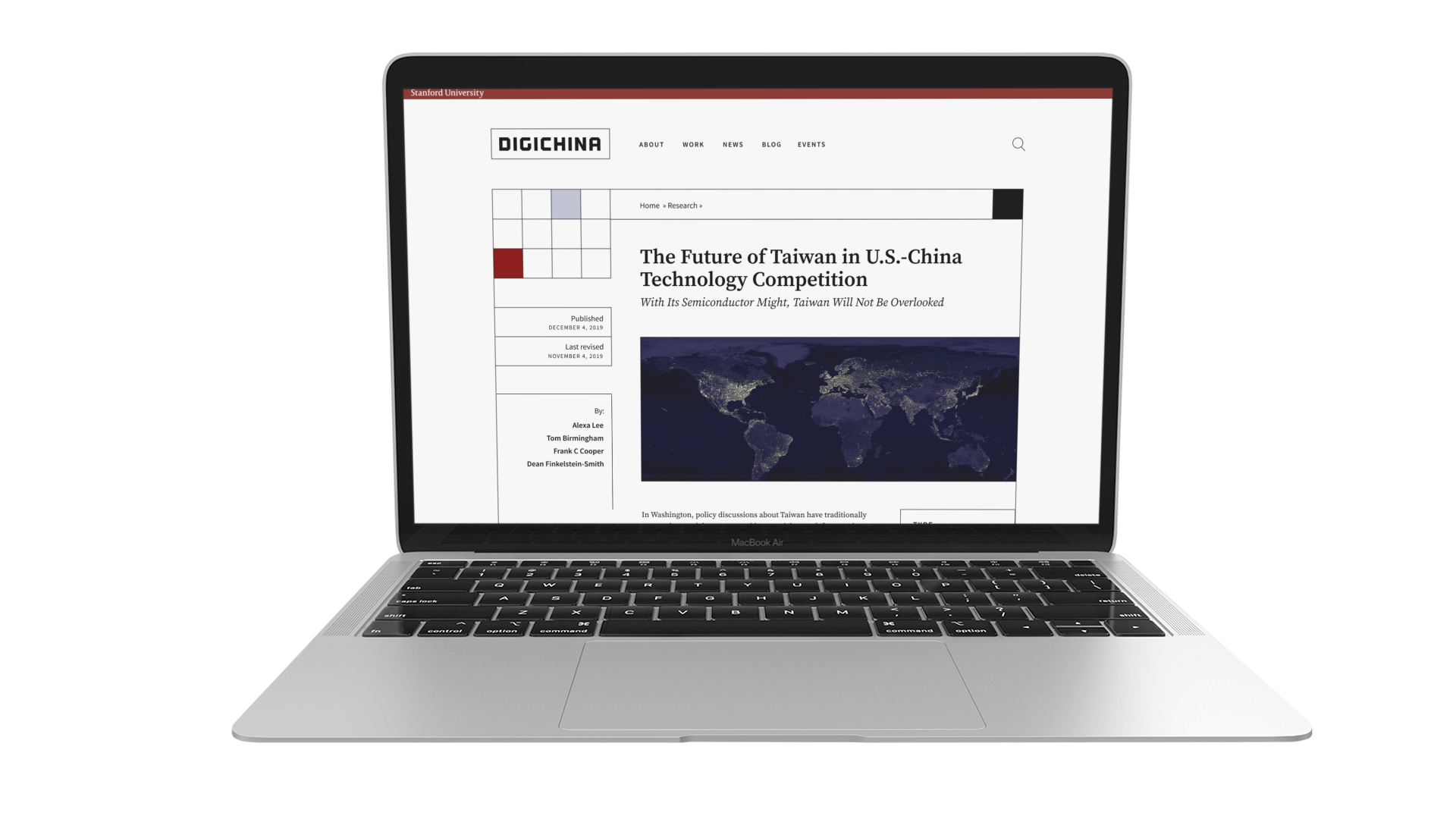
The Stanford team behind Digichina needed a new website for publishing its stories and a new brand identity, too. As creative director and hands-on design lead for this project, I used a modular treatment inspired by Mondrian Lines.
Date
2021
Client
Stanford University
Category
UX/UI
Branding
Creative Direction

01 Problem
The client requested that the website and new brand feel international (rather than specific to China) as to emphasize the collaborative nature of the research and its publications. In addition to incorporating the Stanford top bar, footer, and branding, they asked to make sure the colors don't clash with their partner university, Leiten, from the Netherlands.
02 Approach
The website and branding were done in unison, focusing on creating a modular treatment that elegantly extended to mobile versions of the site, as well as branded materials such as business cards. Considering the sensitive nature of America-China relations, we found it most practical not to mimic Chinese-inspired aesthetics but rather go for something international and one-of-a-kind that works well with the brand colors of both participating universities.
03 Solution
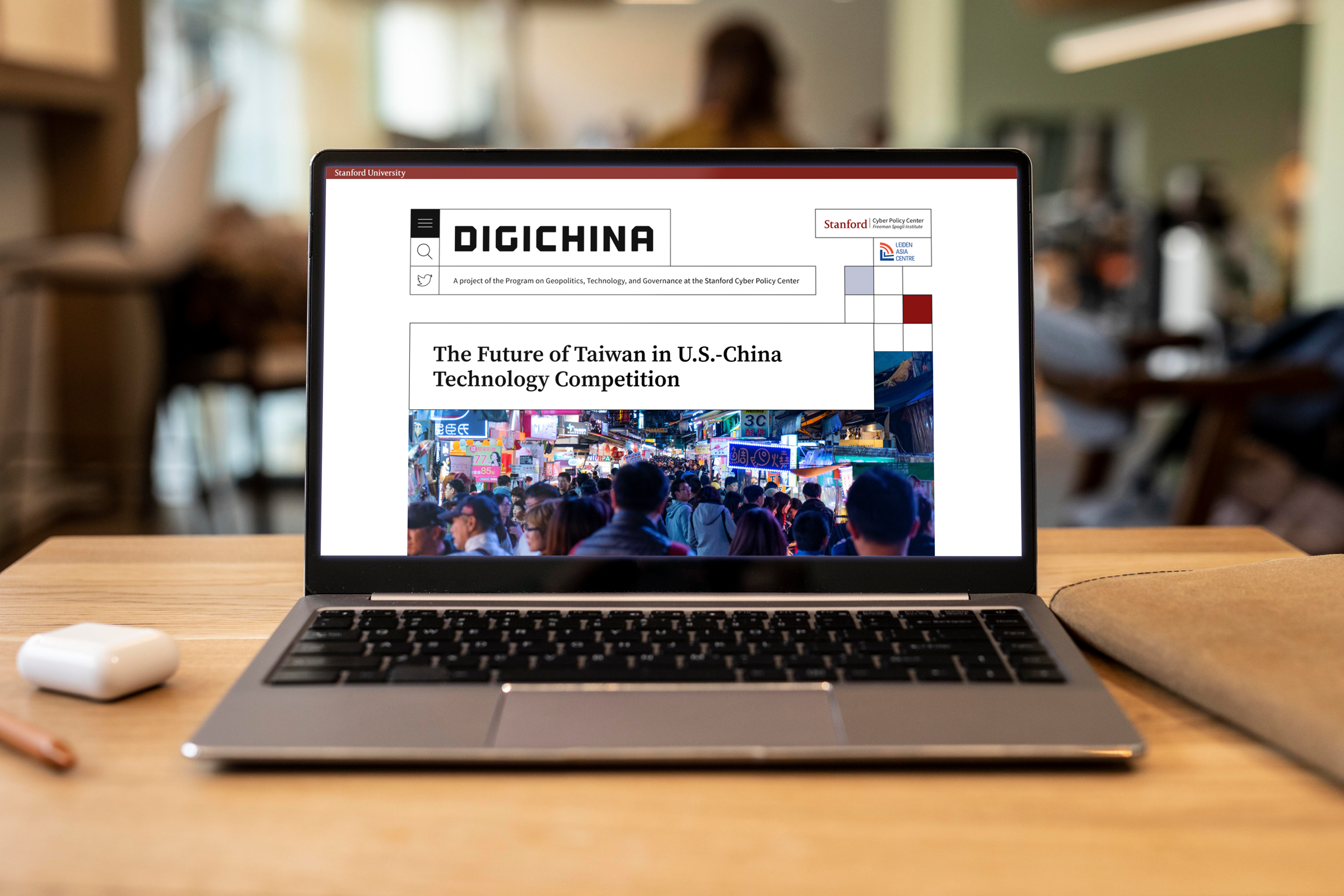
The final design drew inspiration from Mondrian Lines by Dutch artist Piet Mondrian to create a modular design system and logo. Because the design is rooted firstly in Stanford branding, it meshes well with the university's header and footer. This not only allows the content to take center stage, but also makes sure lean into the credibility already established by Stanford's color palette and logo.

The grid system and boxes not only guide users to the menu, but also encase filters and other functions beyond the homepage. They playfully oscillate between form and function, and leave room for expansion in the visual language developed in the process.

Branding
The Digichina team needed a brand identity on top of the website design. And doing the two in unison was very exciting, because it gave me the opportunity to extend the modular treatment from the website toward the branding, and truly fuse the two.
This creates a look that feels very intentional, rather than either the branding or website UI feeling like an afterthought. More importantly, the intentional flexibility of the decorative elements near the logo allow it to perfectly fit into any set of proportions.

Mobile experience
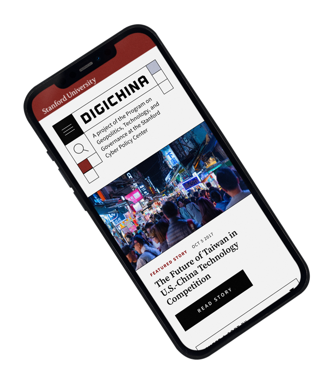
Thanks to the modular nature of the design system, the Digichina mobile mocks don't oversimplify the desktop experience. But rather, they feel consistent with the tablet and desktop views.


Outcomes
Not only was this project completed in a matter of four months, but the client came in within budget, and the site has remained relatively untouched since its release. The client reacted positively to both the branding and the final design, and I personally consider this one of my favorite projects to date.


