Glassdoor Employer Website
As senior UX designer for glassdoor.com/employers, my work led to a 50% reduction in Help Center calls, and contributed to both a 14% increase in conversions and a combined 54% year-over-year surge in traffic to targeted pages.
Date
2018
Client
Glassdoor
Category
UX/UI

01 Problem
The Glassdoor employer website is one of the biggest sources of revenue for the company. During my in-house work as the Senior UX Designer at Glassdoor, and sole designer on the project overall, I worked on a wide range of optimizations across the employer experience.
My first challenge was to make sure the employer website stays up-to-date with the ongoing rebrand, and incorporates new brand elements and design rules as they are being developed.
But to get a better understanding of where to apply my remaining capacity, I paired with the marketing team to gain insights into their KPIs.
02 Approach
Striving to create a trustworthy first impression and maximizing usability through pixel-perfect design is always critical. But by aligning the website with business objectives, I knew to tackle not just the homepage, but multiple other sales pages and flows. And I was able to regularly receive metrics related to the impact of my design changes.
By staying mindful of marketing and sales metrics, we chose to move carefully with design changes, striving to introduce only a few new variables at a time, and regularly pausing to quantify our impact and reflect on results.
03 Solution
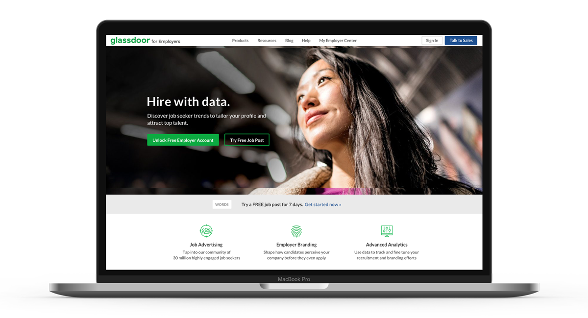
After cleaning up the homepage hero area and iterating on a few different types photos, I began optimizing the sign-up flow for usability, credibility, and responsiveness.
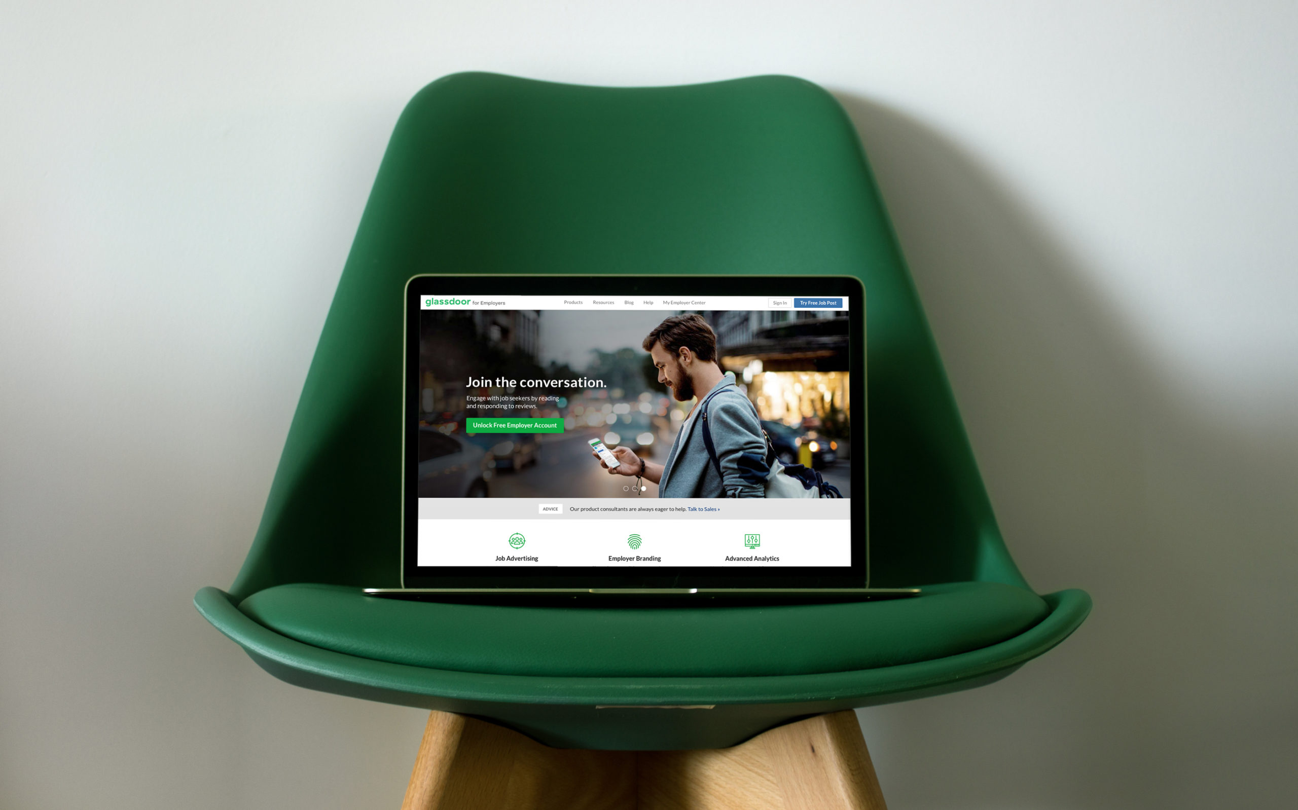
I followed up by redesigning the B2B navigation, which ended up dramatically reducing reliance on the help center (by surfacing important links, not hiding the Help Center link, of course).
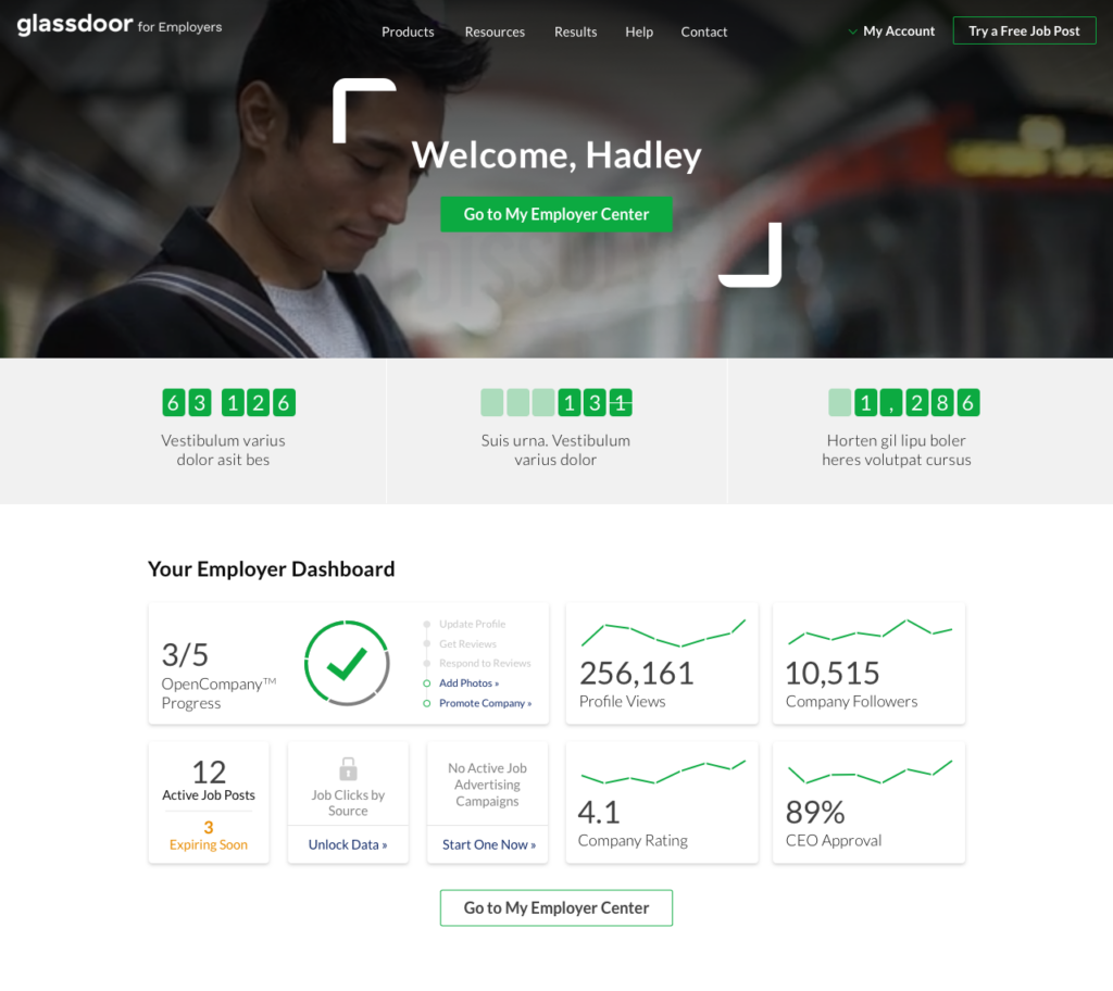
I then created a more targeted homepage for signed-in users, focused on sales, education, and improving community engagement.
Dashboard view for signed-in users
This signed-in view of the homepage includes a progress tracker and checklist for earning “OpenCompany” status.
The dashboard shows profile views, followers, active vs. expired job posts, as well as the company’s rating and CEO approval rate. There’s also upsell opportunities built in, with prompts to “Unlock Data” and start a new advertising campaign.


Results
By redesigning the B2B navigation system, I reduced misdirected customer-service calls by 50%. Revamping the employer account signup process led to a solid 14% increase in conversion rates. This was achieved through a meticulous redesign of the signup form and flow, ensuring a more efficient and user-friendly journey. Finally, my efforts contributed to a combined 54% year-over-year surge in website traffic to targeted sales pages.


